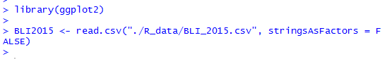
1.’ggplot2’ library 불러오기, ‘Better Life Index of 2015 Years’ 자료 읽어오기
cf) 자료: http://stats.oecd.org/Index.aspx?DataSetCode=BLI

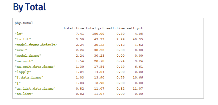
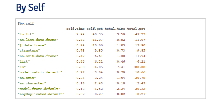
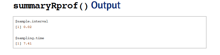
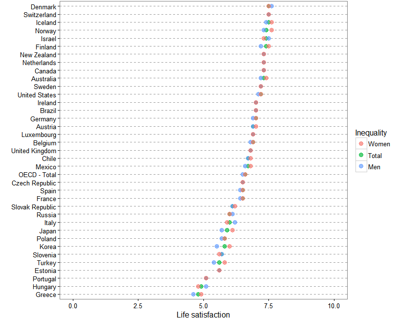
2. 삶의 만족도 소득 상하위 10%, 전체 점수 추출
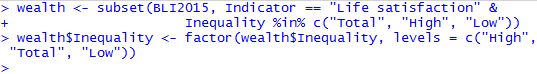
cf) wealth variable
3. 소득 차이에 다른 삶의 만족도


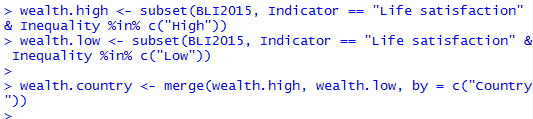
4. 소득 상위 10%와 하위 10%의 만족도 차이


<output - red: Korea, green: OECD total average>

cf) geom_bar(stat = “identity”,....)
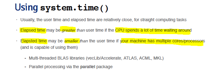
5.삶의 만족도 남녀 차이


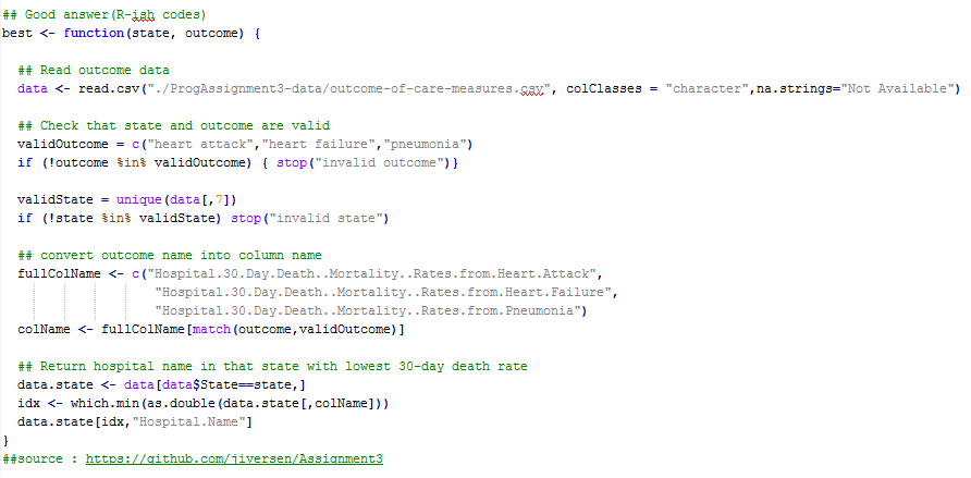
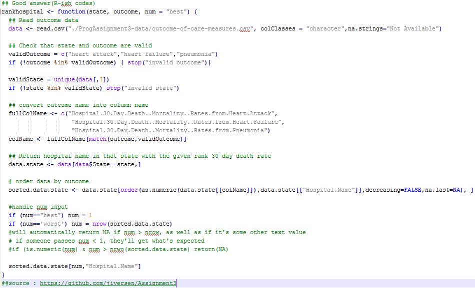
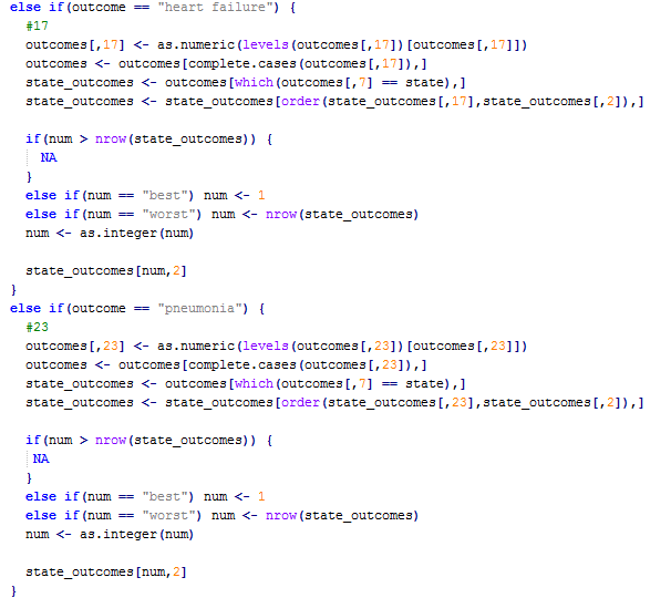
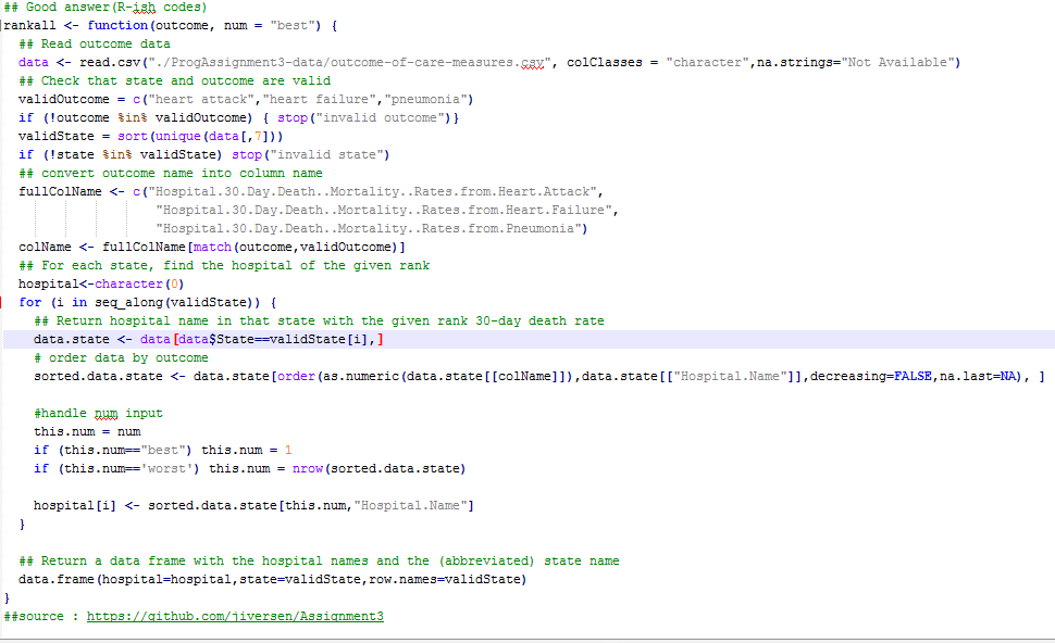
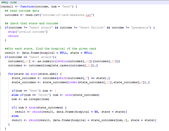
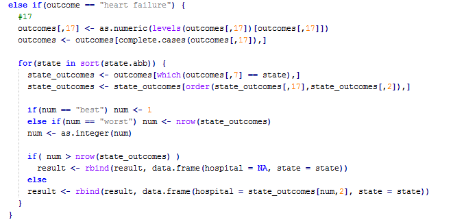
6. 코드

library(ggplot2)
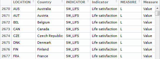
BLI2015 <- read.csv("./R_data/BLI_2015.csv", stringsAsFactors = FALSE)
wealth <- subset(BLI2015, Indicator == "Life satisfaction" &
Inequality %in% c("Total", "High", "Low"))
wealth$Inequality <- factor(wealth$Inequality, levels = c("High", "Total", "Low"))
ggplot(wealth, aes(x=Value, y=reorder(Country, Value), colour = Inequality)) +
geom_point(size=2, alpha = 2/3) +
theme_bw() +
theme(panel.grid.major.x = element_blank(),
panel.grid.minor.x = element_blank(),
panel.grid.major.y = element_line(colour = "grey60", linetype="dashed")) +
ylab("") +
xlab("Life satisfaction") +
xlim(0,10)
wealth.high <- subset(BLI2015, Indicator == "Life satisfaction" & Inequality %in% c("High"))
wealth.low <- subset(BLI2015, Indicator == "Life satisfaction" & Inequality %in% c("Low"))
wealth.country <- merge(wealth.high, wealth.low, by = c("Country"))
wealth.country <- wealth.country[c("Country","Value.x","Value.y")]
names(wealth.country) <- c("Country", "High", "Low")
wealth.country$diff <- with(wealth.country, High - Low)
wealth.country <- wealth.country[order(wealth.country$diff),]
wealth.country$color <- "1"
wealth.country[wealth.country$Country == "Korea","color"] <- "2"
wealth.country[wealth.country$Country == "OECD - Total","color"] <- "3"
write.csv(file="Life_wealth.csv", wealth.country,row.names = F)
ggplot(wealth.country, aes(x=1:31, y=diff, fill=color)) +
geom_bar(stat="identity", position="identity", colour="black", size=0.25) +
xlab("") + ylab("difference of Life satisfaction") +
scale_fill_manual(values = c('#474749','#CC1862','#8CF226'), guide=FALSE) +
theme_bw() +
theme(axis.ticks = element_blank(), axis.ticks = element_blank())
- 본 게시물은 wsyang.com 의 포스트를 참고하였습니다. 한 두가지 오류 수정 및 실제로 코딩함으로써 과정에 대한 이해하는데 목적으로 했습니다. 본 글은 저의 이해를 바탕으로 대충(?) 쓰여졌으므로 wsyang.com에 가시면 더 좋은 원본 자료를 보실 수 있습니다.